It’s easier said than done, however. Especially for web beginners, it can be very tempting to fill every available space with HTML or unnecessary links. There are simple tricks to combat these design pitfalls and create a sleeker page that works.
Less is More
This is the main principle when going ‘minimal’. First thing
to do is pick a focal point and start from there. A focal point is anything
which draws attention to the page: it can be a stunning picture, bold text, or
a combination of both. It has to be significant though; something which
reflects the company’s brand, or text that conveys a powerful message.
After the focal point has been decided on, next vital thing
on the list is typography. This is crucial because it’s the medium through
which a company communicates. Rule of thumb: choose one or two font styles that
are readable, stylish, and work well with the site’s theme. Working with only
one font style is good, but do play around with sizes to make it effective.
Fonts will create impact so don’t take this selection lightly.
Be Bold
Aside from text styles, colors play an important role in
making successful minimalist web designs. When in doubt, check the numerous
online color scheme resources to see how colors affect users and what shade
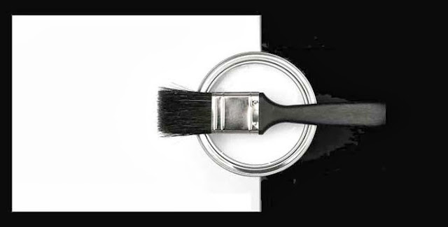
goes with what. Black and white are simple yet dramatic when paired together
for example; but don’t be afraid to use vibrant combinations of red, green,
yellow, or blue.
Bright colors make it easy to spot action buttons (like
‘sign-up’ or ‘buy now’) so pick something that catches the eye. A dash of the
right spectrum also adds that bit of fun in an otherwise ordinary layout, so
this is definitely a good aspect to be really creative in.
No Margin for Error
While no one and nothing is perfect, it’s imperative that
minimalist web designs are ‘almost’
pixel perfect. Since there are less elements, that means less room to hide
flaws and users would be keen to spot missed details. Pictures need to be
cropped in the right dimensions and have super fine quality; articles and
descriptions should be error-free; and the overall appearance should be
pleasing and well-put together. As much as possible, nothing should look out of
place or slap-dashed.


Creating minimalist custom designs is a
challenge and a learning experience. Because most people are so used with
interactive graphics and cluttered layouts, it would take some getting used to
when shifting to this fresher outlook. What’s important is to keep everything
clean, uncomplicated, and to the point. Clients would be thankful – and users
too!


No comments:
Post a Comment