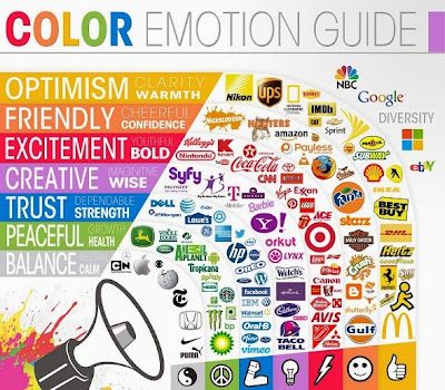
Every web design company, like the New Jersey Web Development team, have their own set of tactics when it comes to creating powerful visual impacts to drive web traffic. While these techniques might be confidential and possibly complicated, there are easier ways to deliver a powerful message through pictures. Proper use of imagery for instance, can definitely optimize a website for better user experience and increased conversion rates.
1. Justify Photos
It's so easy to simply post a photo to complete a blank page or give it a boost. But unplanned or under-utilized pictures are a waste of space. Before placing an image, consider the following aspects:
- the image should reflect WHAT the brand, product, or service is all about
- it should SHOW the benefit of using such product or service
- the photo must ENGAGE and STIR EMOTION from the user
Images that are not carefully thought-out might:
- confuse the audience
- create a negative impact
- be totally useless altogether
Maximize visual impact by choosing each picture wisely and with a strategic plan in mind. Selecting something for the mere purpose of aesthetics can often lead to lost sales.
2. Match Image Details with Usage

An example of this principle in context would be best to describe what this idea is. An online fashion shop will have dozens of individual pictures of gorgeous models wearing trendy clothes. Whereas a website selling appliances might have standalone images of their merchandise. Comparing the two, users are more likely to linger on the images of the models on the fashion shop; while give more focus on the product descriptions of the appliance website.
This shows that how an image is presented must depend on its use. Things like jewelry, clothes, shoes, and accessories should be displayed according to how it should be worn for better impact. While stuff like appliances and gadgets don't need so much detail since customers tend to concentrate on their specifications than their physical attributes.
3. Use Color Accordingly
Web designers already know the influence of colors; but not everyone knows how to maximize them. For years, retailers and web developers thought colors should 'persuade' people to buy certain products. But it is actually the opposite: it's better to choose colors which REFLECT the product or company's personality so that consumers can easily relate to them.
This in turn will give them feelings of familiarity and confidence – eventually leading to a real purchase. Plenty of huge companies (like UPS, Apple, Amazon, and Starbucks) have been using this same principle. They let the colors speak what they're about so over time, people become familiar with who they are and develop trust. People have been known to be loyal to things which they deem reliable.
Conclusion
Sometimes all it takes are little changes to make a website effective. Proper assessment and continuous testing should always be a priority to ensure quality and constant improvement. Follow these visual techniques as a start and see changes in user experience and site productivity.


No comments:
Post a Comment